Regence Error & Outage Messaging
Giving error messages the attention they deserve. When something goes wrong, our members needed clear, actionable guidance, not tech jargon or dead ends.

Problem
The existing error messaging Regence used was vague, technical, and left users without alternative ways to find the information they were after. When data didn’t load or the server timed out, users ran into confusing alerts that didn’t explain what actually went wrong or an easy way around it.
This kind of vagueness led to:
A large amount of support tickets and some low app store ratings being error-message related.
Users becoming stuck and abandoning workflows
Increased call volume to customer support
A mix of formal, casual, and robotic tones across various features of the experience (we’ve all seen it happen)
My Approach
I collaborated with Developers, Product Owners, and Researchers to audit the existing messaging, learn about our backend limitations, and rewrite nearly 30 variations of error messages ranging from minor hangups to critical global outages.
Once I was familiar with best practices and the different ways in which our experience could break, I developed a scalable error and outage message framework in Confluence. This framework served as a set of guidelines that ensured every error message developers implemented across the authenticated experience was:
Clear. No technical jargon, just straightforward explanations that labeled the feature that was broken or missing
Actionable. Messages told users what to do next or who to contact for further support
Consistent. Messages expressed an appropriate level of empathy and conveyed a unified voice across all feature areas
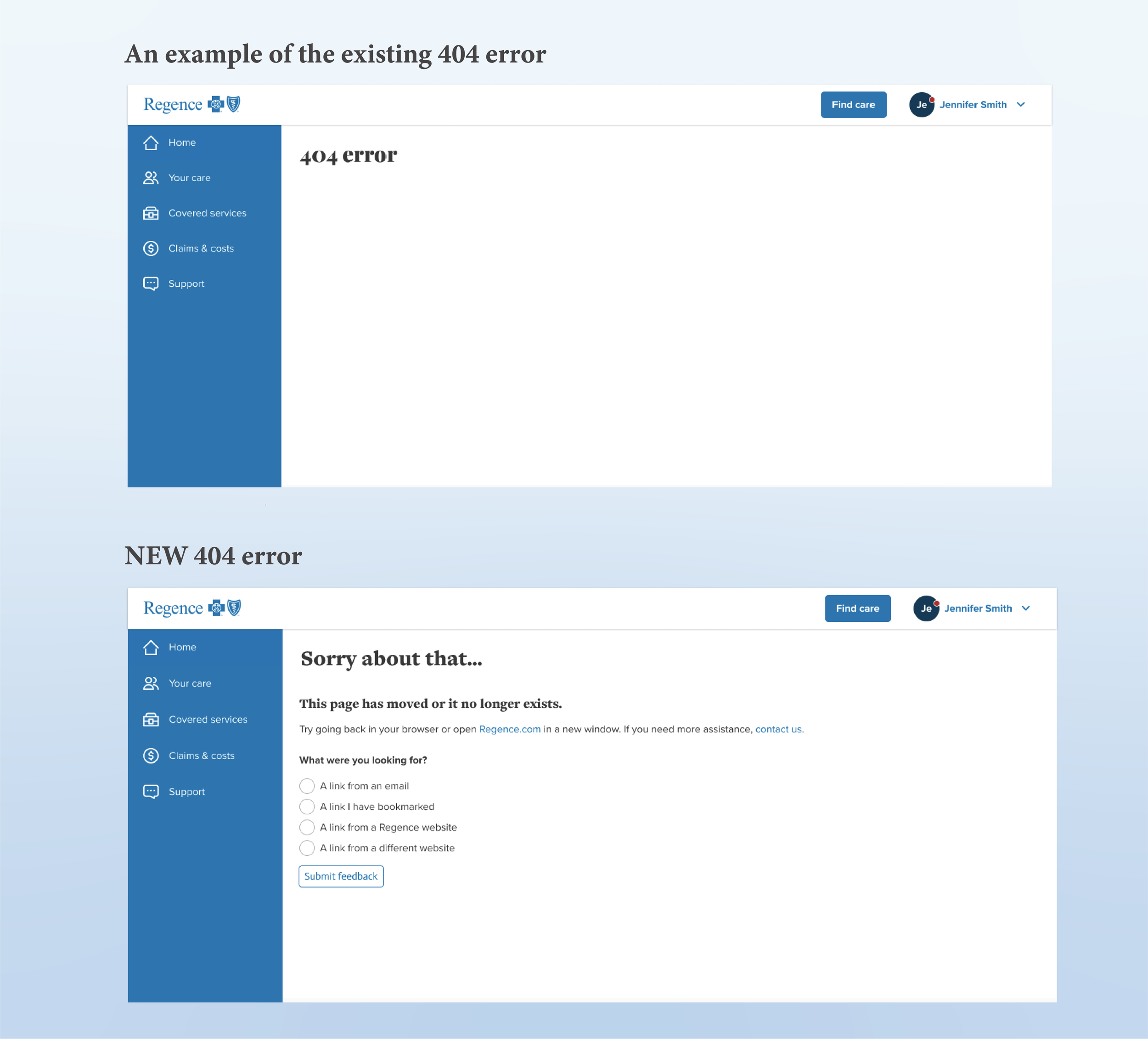
The original 404 error is a great example of an unhelpful dead end often reached by an expired link or a saved tab. The new error kindly offers users a gateway back into the experience or a link to live support. I also took the opportunity to ask where users came from in an effort to better prevent this error in the future.
"It’s a breath of fresh air when a company admits something isn’t working as expected"
—USERTESTING
The Outcome
After rolling out this new error messaging framework:
Error-related support calls dropped by 15% over 6 months
Customer Support now had a standardized language to communicate with callers when they described errors on their desktop or app
Every error message followed the same user-focused structure and adhered to important guidelines around tone. i.e., when are we apologizing versus when are we simply stating something isn’t available?
Every error message identified the missing or broken feature. Because users don’t always know what the experience is failing to display. IE, “we can’t display your dental claims at the moment, please try again shortly” versus, “Problem loading data.”
Challenges
This project was not without its challenges. To begin, there was not a single repository of errors that I could simply audit and update. In an effort to update all error and outage messages at once, the content needed to be added to our healthcare admin platform, Facets. A backup error message was then put into place for global errors (if the whole experience was down), or when our Facets failed to pull content and my framework could not be displayed.
Additionally, Engineering was unable to provide an accurate turn-around-times once these outages occurred. This means pertinent medical information could fail to load for 2 minutes or 2 hours, and I wasn’t able to relay that expectation to the user. This unknown is why it’s so important to give our members alternate ways to obtain their information, like the CTA “See support options” provides.
Takeaways
Error messages are a vital extension of the user experience. They should guide users to alternative options, not confuse or frustrate them further.
Every word matters. Small changes (and human empathy) can make a huge difference in user confidence and feeling like their personal experience is being considered.
Scalability is important. A fleshed out framework with the data to back it up ensures messaging consistency and alignment across teams—which everybody can appreciate.
Intuitive messaging isn’t just about pointing out problems; it’s about helping users recover quickly without losing confidence. A thoughtful approach to these seemingly small digital interactions means the difference between a seamless experience and one that drives users away.