Regence Pharmacy Hub
This centralized experience brings all essential Pharmacy tools into one space. Because managing meds, researching costs, and getting support shouldn’t have to be a scavenger hunt.
Background
Cambia Health Solutions is the parent company of Regence. Regence is a health insurance provider serving folks in the Pacific Northwest for over 100 years. Their digital experience is a vital piece of every member’s healthcare journey, allowing for quick access to benefits, in-network care, telehealth, mental health support, claims, spending and more.
Problem
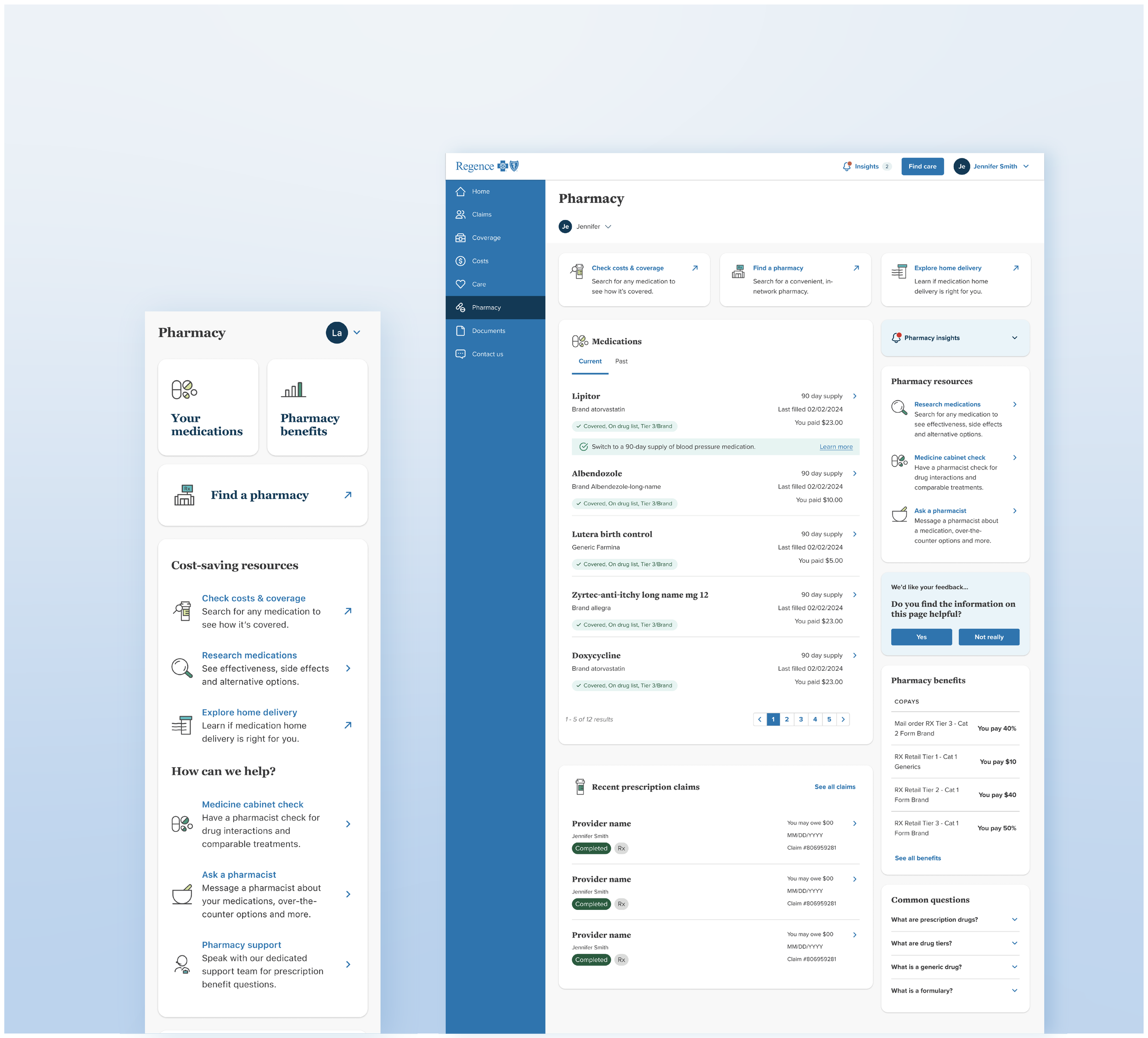
Regence lacked a centralized page for pharmacy-related information, with important features scattered across different areas of our experience. This fragmented approach to our pharmacy tools made resources and benefits difficult to use by premium-paying members.
We needed a single, holistic Pharmacy experience that spanned desktop and mobile platforms. Its focus? Discoverability, visual hierarchy, and a friendly, conversational tone to provide our members with what they desire most: clear information, cost transparency, and real human support.
Tackling The Low-Hanging Fruit
To kick us off, I used unmonitored card sort studies and third party user research to uncover our users’ expectations around their health insurance app.
Once hypotheses were confirmed, I didn’t hesitate to list “Pharmacy” as a standalone page in our new navigation as I found this title to be an industry standard in terms of medication resources.
This small but impactful change was vital to increase discoverability.

My Approach
I immersed myself into everything pharmacy, mapping out and highlighting the pain points in our existing experience while diving deep into the user flows of successful pharmacy apps such as GoodRx. I wanted to get a good understanding of what was working well for our competitors and where we needed to bridge our own gaps.
Next I collaborated with Customer Support, Clinical Pharmacists, fellow Designers, and Researchers to identify our users’ needs, connect with our third-party partners, and scope the project as a whole. Then, with a Human-Centered Design approach combined with our brand’s conversational tone, I crafted the app experience of Regence’s first ever Pharmacy Hub. The hub served as a one-stop destination that:
Used visual hierarchy to present users with the information we know they’re after
Sectioned out key pharmacy features into scannable lists of either cost saving tools or pharmacy support
Used approachable language for headings as identified in our user research, i.e., “How can we help?” versus an objectively colder “Support Options.”
Separated lists of users’ medications into a current and past category with pagination for easy access
Answered common questions around pharmacy language and benefits to reduce call volume and provide users with a self-serve tool
Focused on concise, action-driven microcopy and descriptions to help users navigate the hub with ease
Crafted visually balanced and action oriented descriptions for important flows
Helped Regence members spend less time searching and more time making informed medication decisions leading to better health outcomes

Language as a self-serve tool
Developing clear, user-friendly language for "Insights" and "Common Questions" was crucial. Both areas are designed as self-serve tools to help our members access valuable information about their medications, health conditions, and healthcare terminology.
The biggest challenge was ensuring the content was clinically accurate yet digestible for a wide range of users. Anticipating user frustration before it happens is key to crafting a seamless experience and the FAQ section titled "Common Questions" played a role in proactively addressing concerns before they escalated into support calls.
Iterate Accordingly
This MVP focused on how we communicate with our members and solved for the pharmacy feature-sprawl across Regence. I worked closely with the Product Owner to map the experience of competitors like GoodRx and prioritize net-new features Regence would use to enhance the experience further in 2025. Regular product planning allowed teams to develop a unified vision forward and guardrails to limit scope-creep.
In the meantime, analytics displayed a staggering increase in visits to Pharmacy features (300% in some cases!) so we made the decision to stand up a short, 5 question feedback card to ask our users about their experience directly.

Feedback Card
Bringing in a simple, non-intrusive feedback modal to capture user insights without disrupting flow was a quick and effective way to have our members assist us in the continued product planning behind the scenes. Once live, this feedback card garnered a lot of positive attention and it quickly became a beloved member of our design system.
Outcomes
Visits to pharmacy related tools increased by 300%
The once buried “Ask a Pharmacist” feature saw a vist increase of 50% and members were raving
Members learned about home delivery options, leading to increased medication adherence and better health outcomes
Takeaways
Discovery is a game-changer. These important resources and benefits mean nothing to our users if they don’t know they exist.
Clarity and brevity reduce friction. Users need direct, action-driven language to guide them. Simplifying terminology and making navigation intuitive ensures folks can find what they need without frustration.
Scannability matters. Users don’t have time to dig through dense paragraphs, especially when at the doctor’s office or searching for an in-network pharmacy. Breaking down content into clear sections with concise headings helps them find what they’re looking for.
Consistency enhances usability. By maintaining unified tone, iconography, and structure across all pharmacy-related tools, the hub feels seamless while reducing cognitive load and increasing visits to the page.